
Recently in the last few weeks while taking photos, I’ve been experimenting with editing them in black and white, or greyscale, which is something a bit different for me. I usually keep my nature photos in colour, because black and white can make some parts of a busy nature scene slightly indistinguishable, but I think that this creates an entirely different mood in the photos and draws our attention to different parts of the images. I am also currently shooting a roll of black and white film on which I have taken some nature photos, but unfortunately haven’t had much time to fill it up, so I’m keen to see how those turn out.

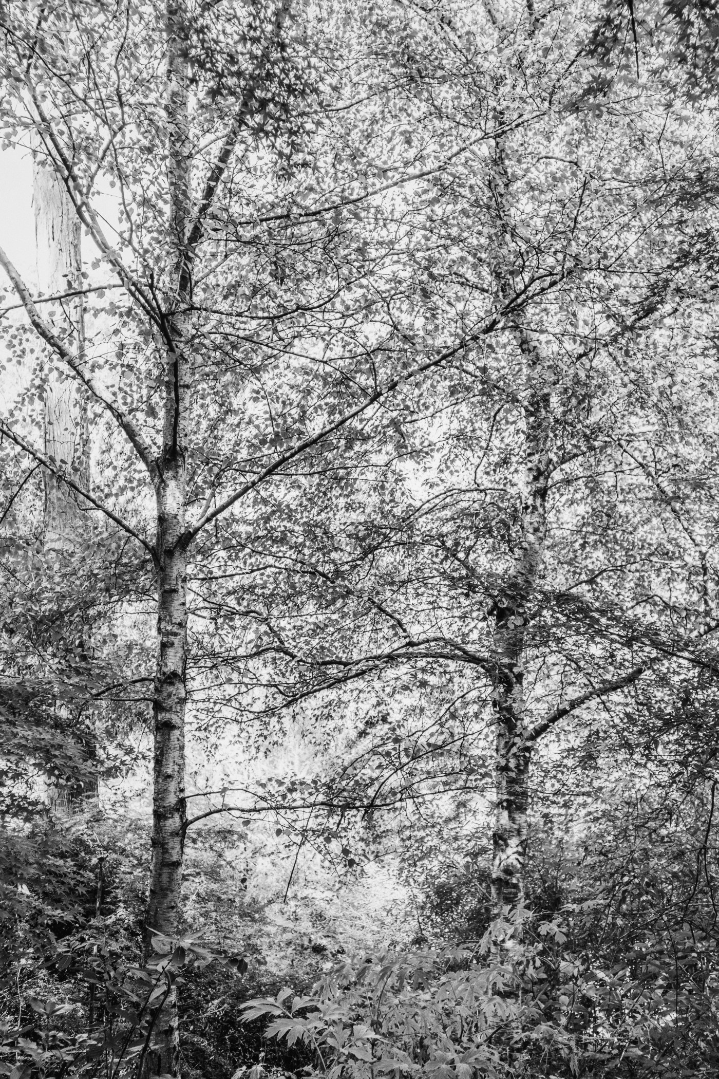
It’s interesting to me how black and white photos feel so much more nostalgic and almost present the world as if those were captures from another time. When photography first became recognised as an art form, colour photography was actually frowned upon slightly, as only black and white photography was seen as ‘art’, even in nature. Nowadays, I don’t think I see a lot of nature photography shot in black and white, because part of the appeal of nature is all the beautiful colours. I know I’ve mentioned this before but I love how black and white allows our attention to be focused on the shapes in an image rather than the colours, and there are lots of beautiful shapes in nature also that I think deserve some spotlight. For example, in the first picture (above), the coloured version just looks like a sea of scattered leaves, but I like that the black and white draws attention to the reason I took the picture – to showcase the straight trunk in contrast to the crooked trunk.


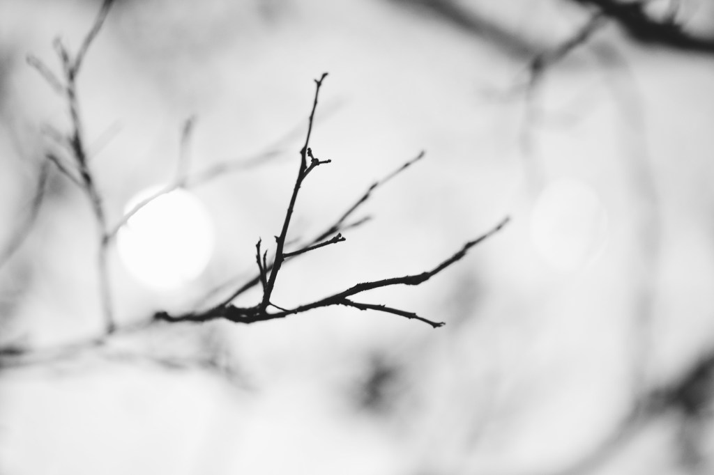

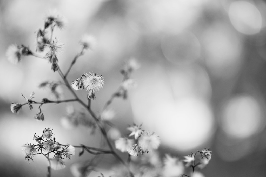

Nature is a very busy subject to capture and there are many ways to work with that. In some instances, photographing the busyness is what makes the photo work. In other instances, a shallow depth of field can be used to simplify the busy environment. But in these images, I’ve tried to use black and white to either focus our attention on something specific within a busy environment, eradicate unnecessary distracting colours, or allow focus to be drawn to the shapes or composition of the photos.


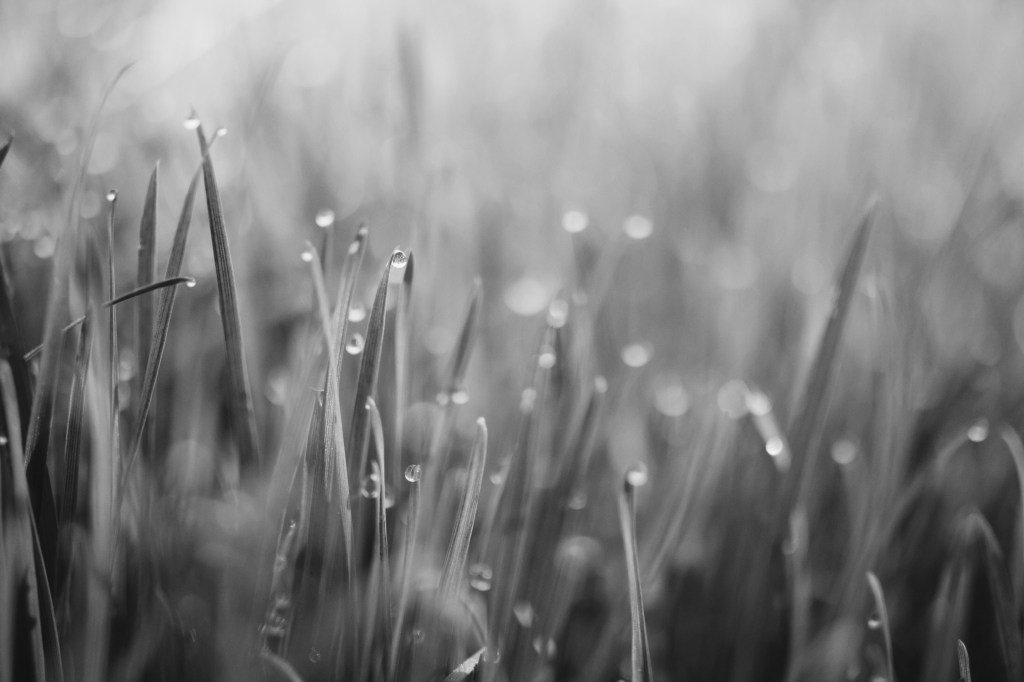
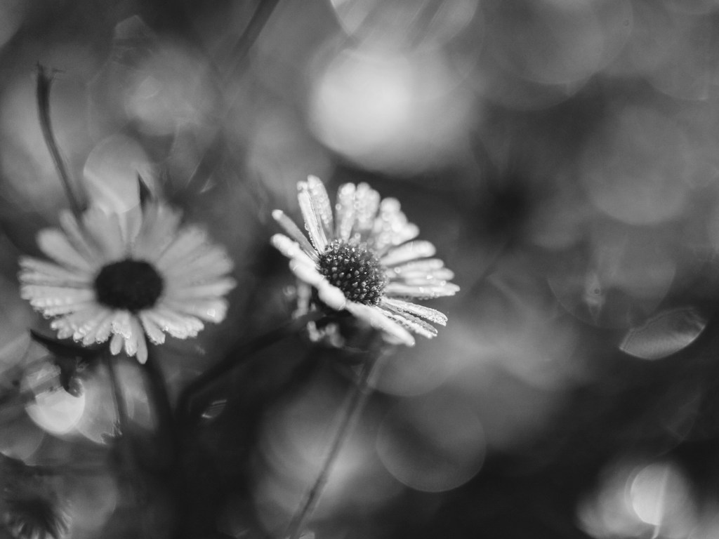
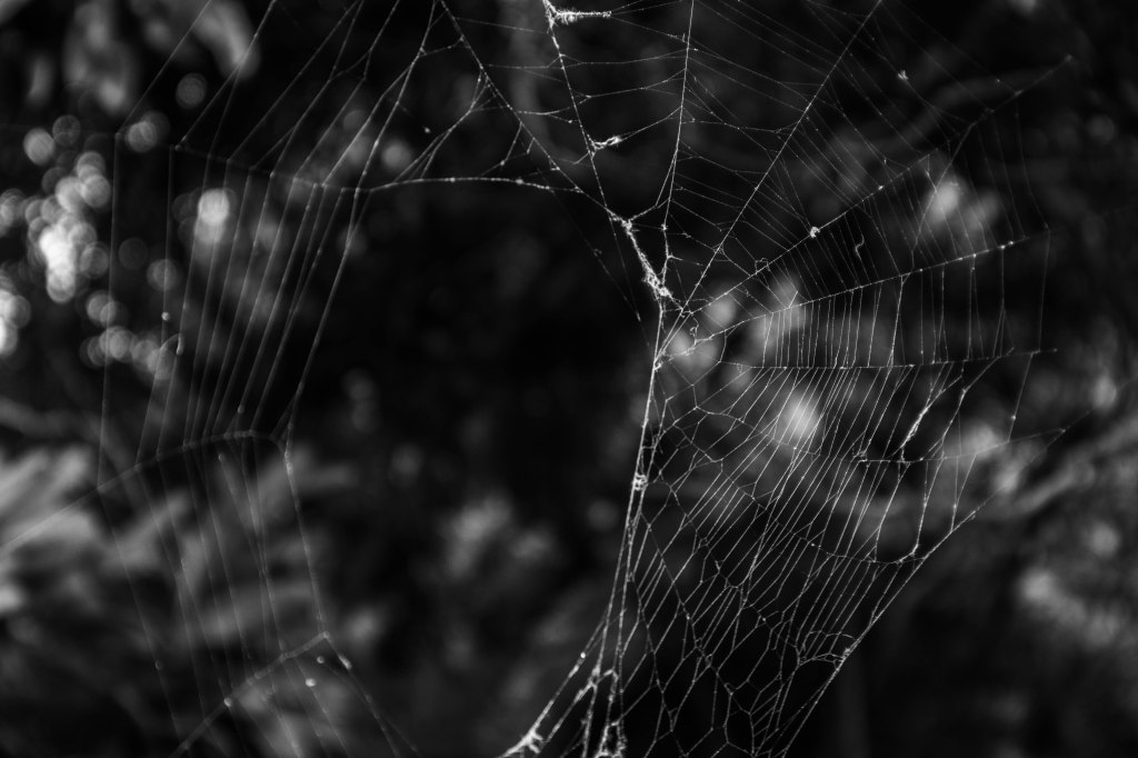
Nature is definitely my favourite thing to take photos of but in an endeavour to constantly be improving my photography I wanted to do this to try and see my images in a different way. Black and white is never really an option I consider while in post production of my nature images, so this was to see what kind of difference it makes, and I think when applied correctly, black and white is better than colour. For example, it made the grass photo appear less like a stock photo, made the spider webs stand out so much more, erased ugly colours that distracted from the focal point of the image, and made the tree in the river reflection so much easier to see. I think this is definitely something I will be applying to my work more often, and it has also encouraged me to not shy away from taking photos of nature on black and white film, if ever I’m shooting a roll.

