
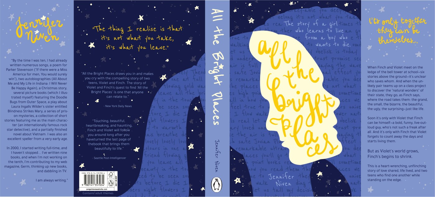
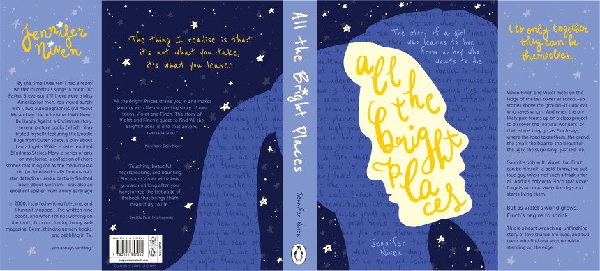
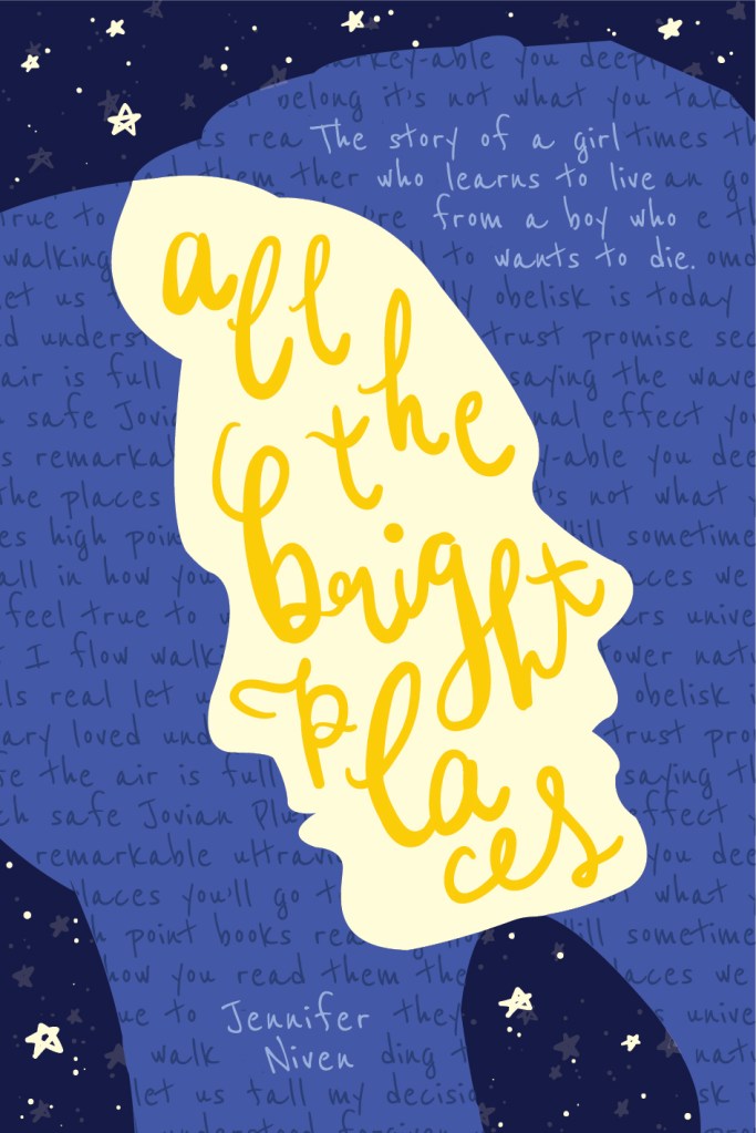
Synopsis of the book and inspiration behind my cover:
‘All the Bright Places’ explores many themes including and surrounding love, mental illness and grief, but I believe the main message in the book is a lot more than that.
The title is quite significant as the book explores the idea that there is both darkness and light inside every person, and the bright places can only exist in contrast to the darkness. So, although both Finch and Violet were struggling with darkness, they made life a little brighter for each other and found bright places within each other.
The book also explores the idea of ‘it’s not what you take, it’s what you leave’. This idea is expressed through metaphor in the book as they visit a lot of places and insist on leaving something behind in each one, but the main message is about the pieces of ourselves we leave behind in each other and in the world, even if we’re no longer there.
Concept and reflection:
Overall I am very happy with my finished product, especially with the way the imagery flows from one page to the other, and leads the eye down the back cover, but the front cover still works on its own. The colours aren’t too bright and happy, but have a strong contrast which suit the message of ‘brightness only exists in contrast to the darkness’ that I am trying to convey.
The overlap of silhouettes successfully shows the ‘brightness’ that the two main characters find in each other and the words acting as a pattern within the shapes are all found in the book as a part of Finch and Violet’s ‘thought wall’ which is an important motif in the book.


Hi! I just adore your cover remake of All The Bright Places. Do you ever print the covers you design? I would love to buy a sleeve from you that would fit a copy of the book if so. If not, know that I love it all the same!
Beautiful work and thanks for doing what you do! Best wishes.
LikeLike
Hello! I just found your cover redesign and I’m obsessed 😍 Is the dust jacket available to purchase?
LikeLike