

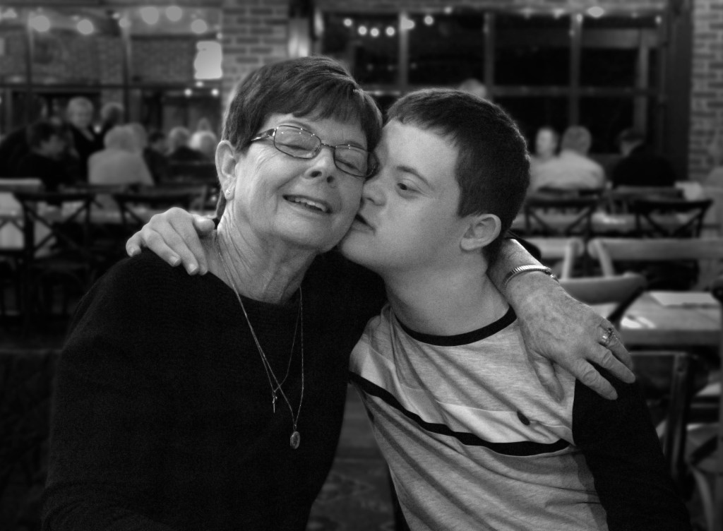
Alright I’m going to try and not ramble too much here but basically these are all my assignments I did at Uni this year (my second year) studying Illustration and Animation, not including life drawing because I made a separate post on that already. I wrote little overviews for each class and assignment and what they entailed, but I guess if you don’t want to read them just look at the pictures and videos!! I thought this would also be a fun and concise way for me to look back and reminisce on the things I did in my second year of uni 🙂
Semester 1
Design Language in Media Arts
This course was all about learning to recognise and analyse the ‘design language’ found in the art styles of different designers, whether it be in film, illustration, photography, or any other form of art. Design language encompasses the different elements and techniques used to create a design, or the ‘rules’ set in place that make a design unique or have it’s own ‘language’.
Project 1 – Pinterest Style Guides
Our first assignment which carried across all three subsequent projects, was basically just creating Pinterest boards that collected our research and inspiration for each project, showing the design language that we intended to implement into our own work.
Here is my Pinterest if you wanna take a look: https://www.pinterest.com.au/laurenkathleen_/
Project 2A – Pixilation Music Video
This project involved creating a 30 second music video using a stop motion or pixilation (stop motion of people) animation technique. I am mostly happy with this despite some issues with pixelation and overexposure of some of the photos. I decided to use illustration as well as photography in this project to illustrate the song’s lyrics.
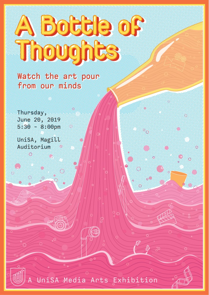
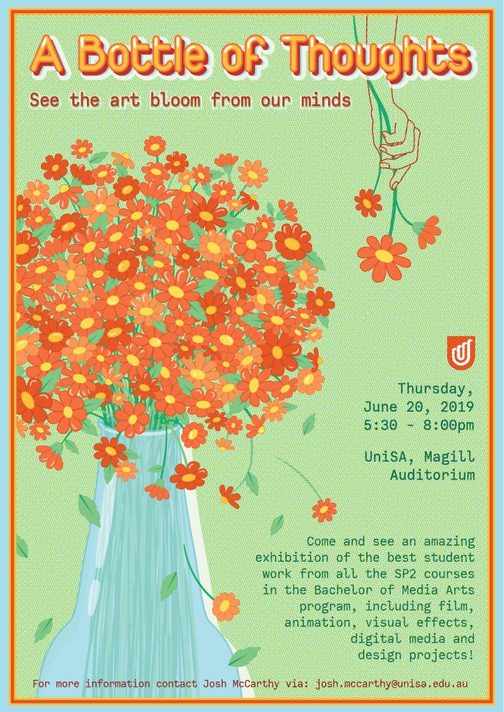
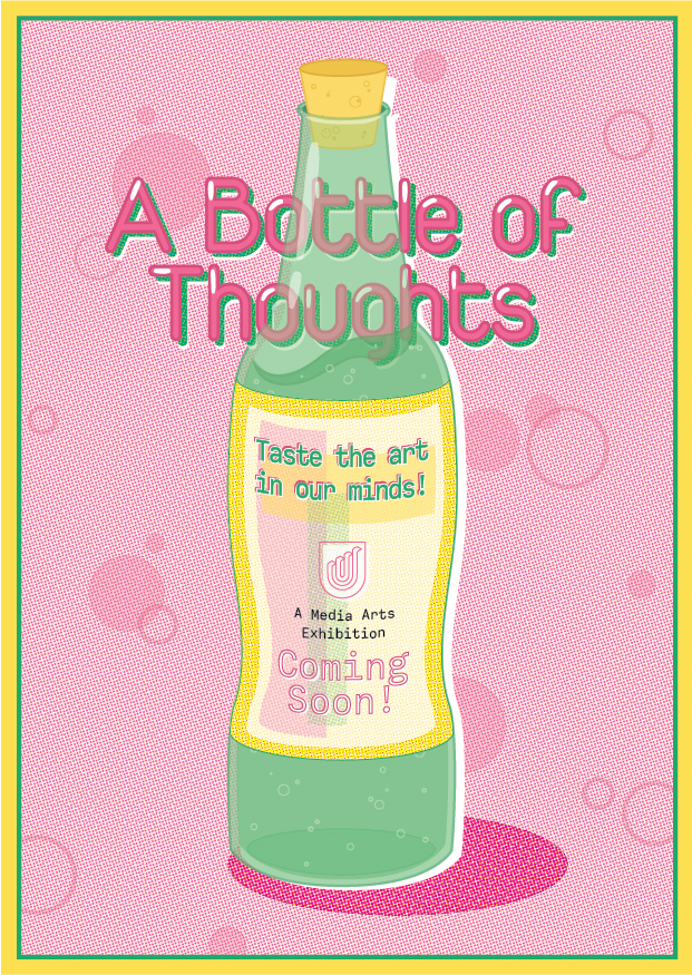
Project 2B – Marketing Poster Series
This assignment was to create a poster, pamphlet and postcard to market the upcoming media arts exhibition that would display the best student work from across all the Media Arts courses. I used my own branding and the idea behind this blog as my idea for the name of the event, to symbolise that the exhibition was an opportunity for viewers to experience what was once just an idea or a thought. I am extremely happy with how these turned out and the retro look with the half-tone dots and layered text is something I want to implement into more of my designs.
Project 3 – Design Presentation
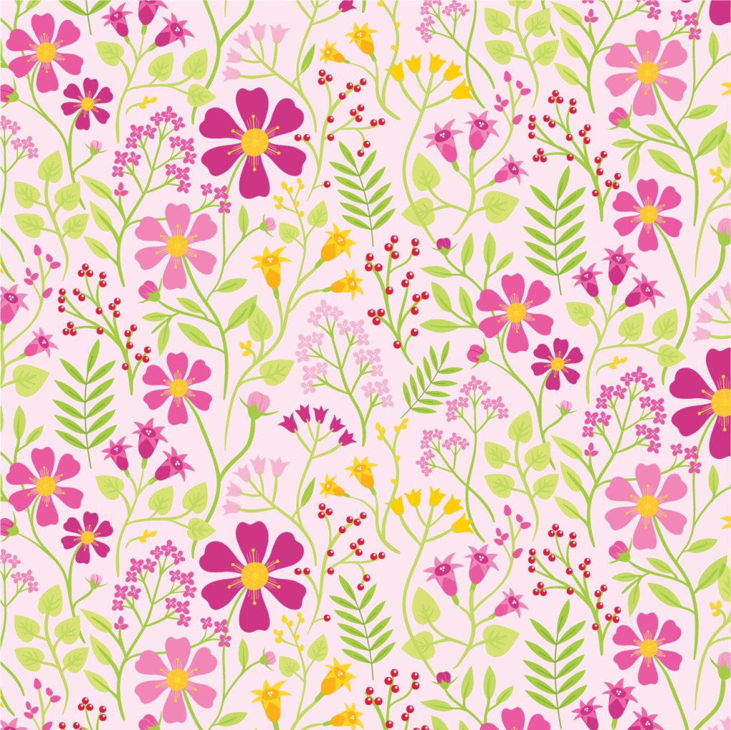
This next project was definitely my favourite from this class and allowed for much more self direction. We were to choose a designer and analyse their style and design language, then create our own work influenced by theirs. I chose pattern designer, Nancy Wolff, and took inspiration from her floral patterns to create my own, while adding my own personal touch with my colour, line, and application choices. I initially made 3 illustrations designed as a set of prints, then adapted them into repeating patterns. Pattern making is a technique I had never tried before, so this was an opportunity to learn and is definitely something I have been experimenting with more since then.
Nancy Wolff’s work: http://www.nancywolff.com/
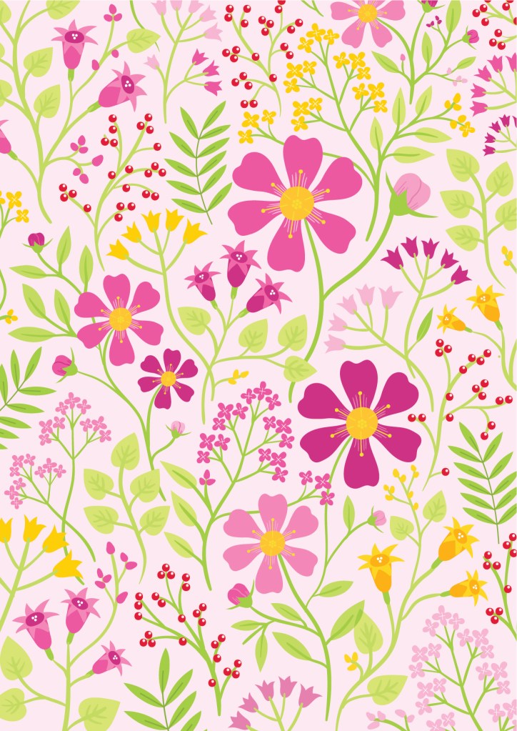

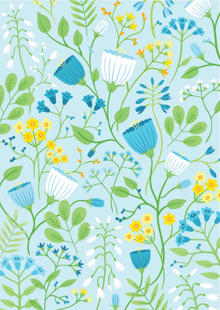
These designs can be bought here: https://society6.com/laurenkathleen_


Another part of this project was creating an interactive PDF to present our analysis of work and our process throughout the project. We learned how to create menus and buttons in InDesign, and the presentation was the main thing we were marked on, so I put a lot of hours into it, but overall am very happy with the result. I couldn’t insert it into this post but you can download it if you want to look at it. It also shows some other ways that my designs can be applied!
Animation Design
This class was basically just about learning the fundamentals of 2D animation in Photoshop, or if we wanted, Harmony. I mainly used Photoshop because that’s what I’m comfortable with.
Project 1 – Looped GIF
The first project was creating a 12 frame loop animation of a robot, so I created this (definitely more than 12 frame) animation of a robot armadillo that took a lot longer than it looks like it took.

Project 2 – Lip Sync
This is definitely my favourite animation from this class. We had to choose a piece of audio that was 3-6 seconds long and lip sync a character to it. I had trouble designing my character to begin with, since it morphs throughout the animation, and I had a super hard time figuring out how to draw the hands, but I really like it, especially because I managed to sneak in some Dr Who!
Project 3 – 5 Second loop (theme: baby)
This animation was the final project, meant for us to show everything we’ve learned, and the theme of baby was, at the time, the Loopdeloop animation competition theme. I really like the jump animation at the beginning, but the mother elephant trunk movement could definitely be better. Also it was really hard to get the butterfly flight pattern to loop, but I like it overall!

Digital Photography
The main aim of this class was to learn about how to use the manual settings on a digital camera and how to develop a streamlined and successful post production process, as well as learning to recognise photography as a fine arts medium. I thought that there was probably too much emphasis on learning how to Photoshop and not enough emphasis on actually learning how to take good pictures. The general vibe of this class was that we were learning how to make mediocre pictures good through editing, rather than learning to take good pictures in the first place.
Weekly Photographs
Each week we would receive a prompt and were to take a photo according to that prompt. This was good because it meant I was continuously taking photos and was forced out of my comfort zone a bit with the different subject matters. I’m not going to explain every single photo, but my favourites are definitely from weeks 4, 6, 7, and 11.
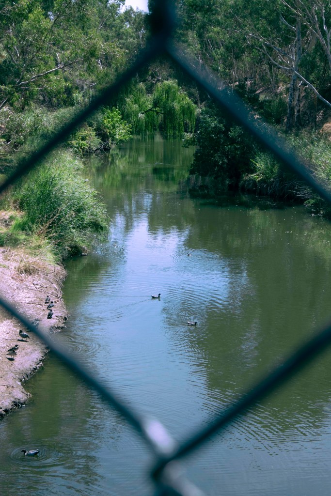
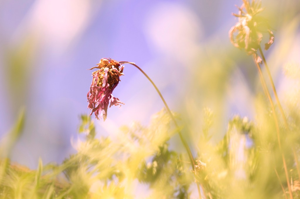
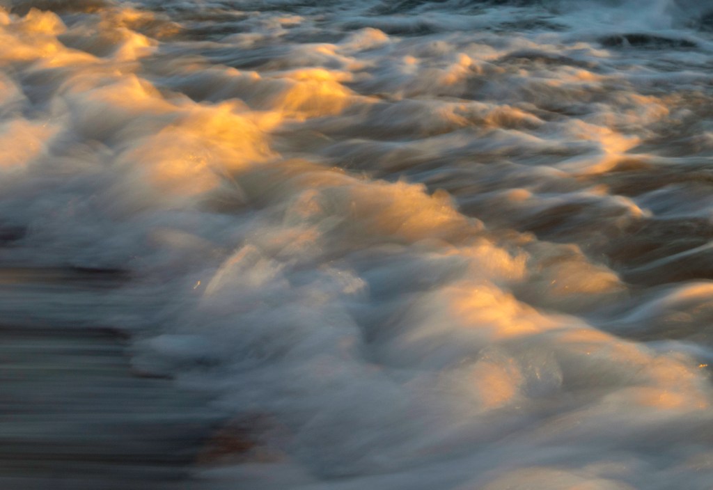
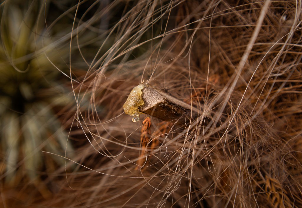


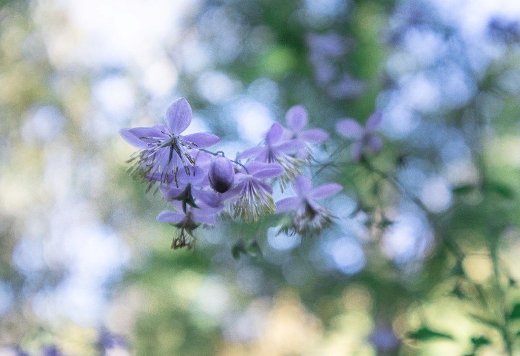
Homage
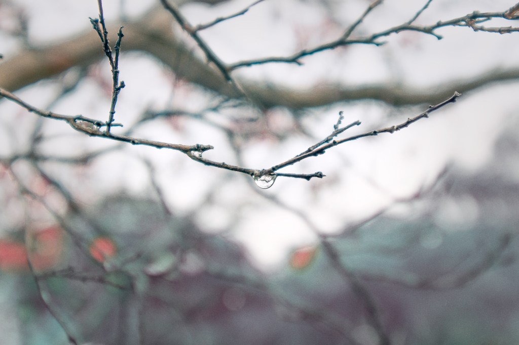
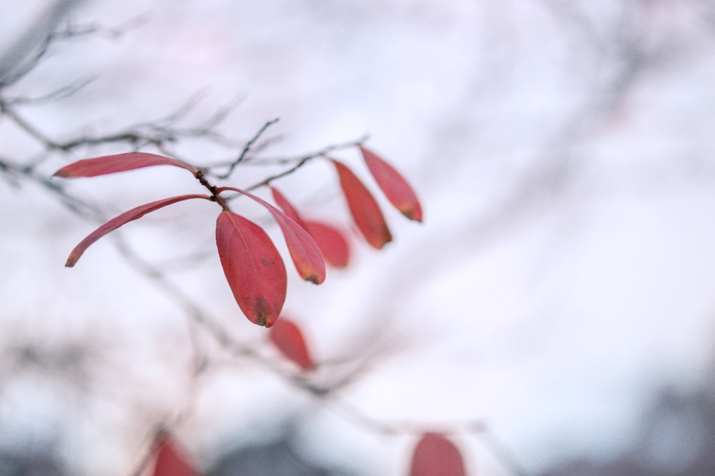
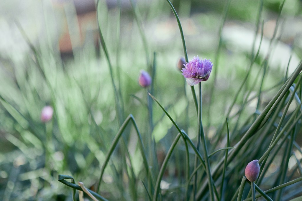
The homage assignment involved choosing a photographer, analysing their style and then creating a series of 6 or more images mimicking, or paying homage to their style. I chose Croatian photographer Ines Perkovic, and took inspiration from her close up nature photography, as this work is quite aligned with the types of photos I like taking. While doing this assignment, I purchased a new camera lens, which went down to a 1.4 aperture. This absolutely changed the game for me and allowed me to take much better photos to suit this style!
Ines Perkovic: https://www.instagram.com/inesperkovic/?hl=en

Digital Compositing
I’m not gonna lie, I really didn’t like this class. We used a program called Nuke, that just didn’t click with me and that my brain just couldn’t comprehend. Not to mention the fact that I’m really not that interested in the VFX side of things cause I just wanna draw! However I still managed to get a pretty good result from my work.
Project 1: Basic Composite
This assignment was just to demonstrate our learning of creating different moods using the colour grading tools in Nuke. It didn’t actually take super long and since I like photography and photo editing, this part was actually pretty fun! I also liked putting the video together.
Project 2: Complex composite
The complex composite involved utilising some more complex compositing techniques which I was going to list but I don’t remember the names of them because that’s how unimportant my brain thinks that knowledge is. Anyway, I don’t know if we were supposed to tell a story with this, but I was SO stuck for ideas about what to do and this is eventually what I came up with. VFX and film is really not something I’m used to coming up with ideas for. While a lot of this assignment was extremely tedious and I could have probably gotten better results had I known how to execute the techniques better, I think it’s not too bad, and I got a good laugh out of editing the final video together with the sound effects.
Project 3: Showreel
Next we made a showreel for which I did some more colour grading, because that was fun, made some adjustments to my apple animation to make it a bit better so I could include it, and then made a weird ghost animation because I wanted a way to include a 2D element, because that’s the sort of animation I actually like. Overall, I quite like the result of this, and most of my assignments, because even though I would have much rather not done it, I still gave it (mostly) my all.
Semester 2
Illustration Animation Studio 3
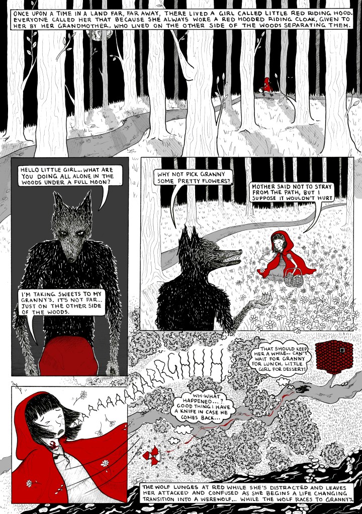
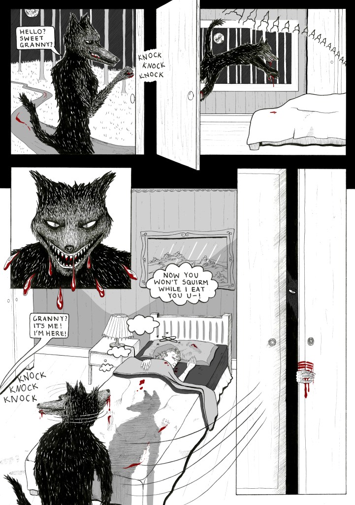
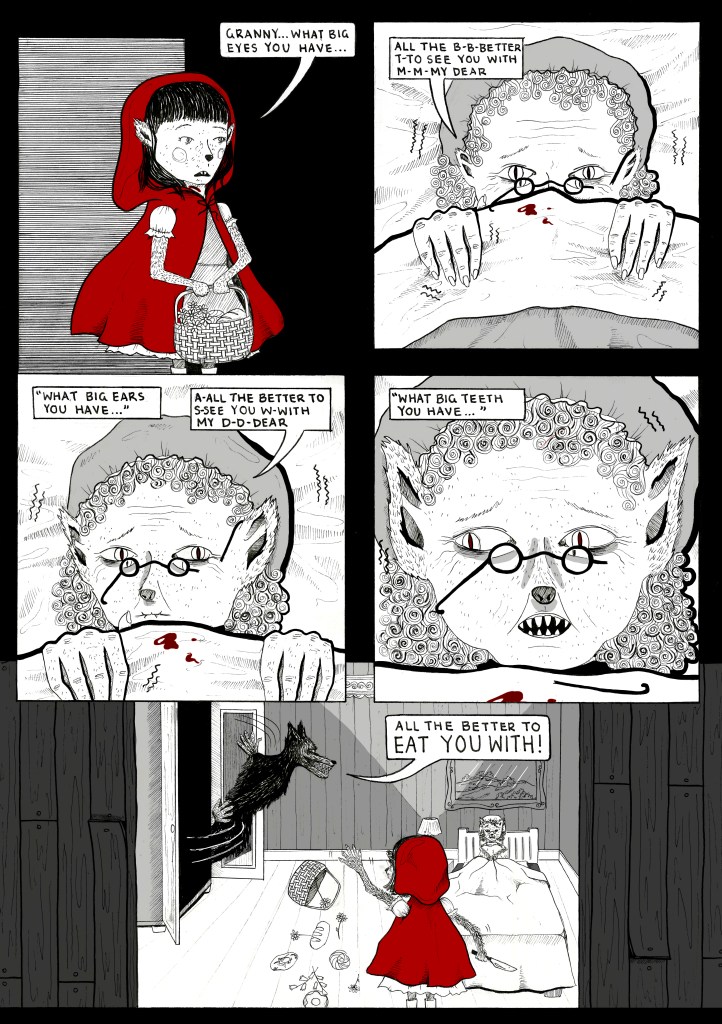
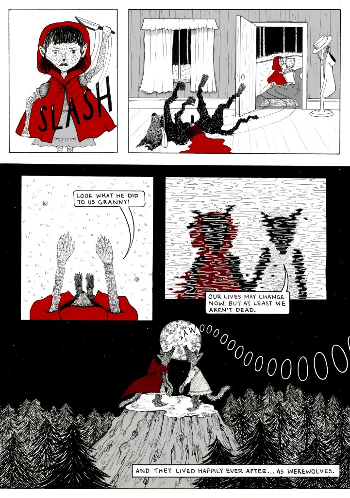
Project 1 – Fairytale Comic
This project was one of my favourites from the year as it was one of my only opportunities to draw with traditional media. The assignment was to create a 4 page comic telling the story of one of three fairytales provided to us. I chose Little Red Riding Hood. I drew the original artwork on A3 cartridge paper and then scanned it, added some colour and tone, and then presented the final comic at A4 size. I am extremely happy with how this turned out despite having never done something like this before, and it taking many many hours.
Project 2 – Independent Project
This was one of my favourite projects of the year as it was entirely self directed. We had to first create a brief that provided research and context for the project, as well as outlined any parameters we set for ourselves. My brief was 1900 words so I’ll just summarise here:
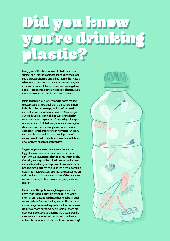
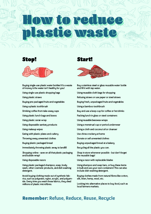
I wanted to create a series of posters that illustrated the impact that ocean pollution has on human health. I took this direction as I feel people will be more inclined and persuaded to make changes to their lifestyle if they can foresee a negative impact on their own health and future. The ideas presented in these posters are focused around the idea that when we eat seafood or drink bottled water, we are actually ingesting microplastics – the remnants of the plastic waste that has broken down in the ocean never to completely disappear. The final poster I created shares a slightly different message, one that projects an image of ourselves, as humans, into the situation of the ocean life that is smothered by plastic waste.
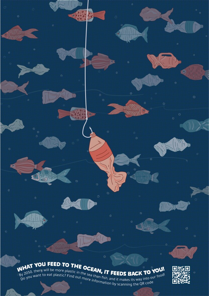

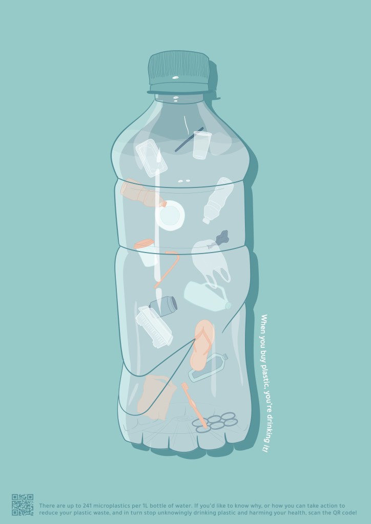
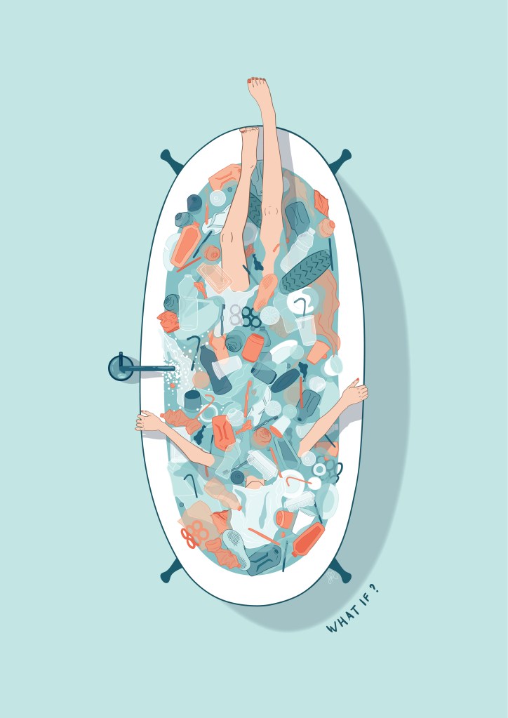
I also created a PDF that links to the posters via a QR code, that shares more information on the issue for anyone interested and shares some tips on how individuals can make a difference.
There was an enormous amount of thought and behind the scenes process and development that went into this project that I can’t even show because who wants to look through a 43 page process document? But I am so happy with how these turned out!
Project 3 – Animation
Quadruped Walk Cycle
Pretty self explanatory, just had to pick a four legged animal and make it walk! I used Photoshop for this and followed the same process that I did in my Animation Design class to animate a gazelle!
Motion Comic
Here we had to adapt our previously completed fairytale comic into an animation, either using this motion comic style, or creating an animatic. It had to be 10 seconds long, but as we can see I went way beyond that. This was pretty fun to do and showed us ways that we can use previously completed work to create something new and present the story in a different way. The biggest challenge with this was cutting out all the imagery, filling in the backgrounds to match and creating all the layers so they could be moved and animated in Photoshop.
Character Performance
This class was all about using Autodesk Maya to model and animate characters in 3D. Maya has caused me much trouble and distress in the past but this time it honestly was much better, despite the rendering taking me a solid couple of days. Best thing I did with these assignments was aim to have them finished at least a week early to leave an entire (hopefully not stressful) week to render.
Project 1 – Character model + turntable
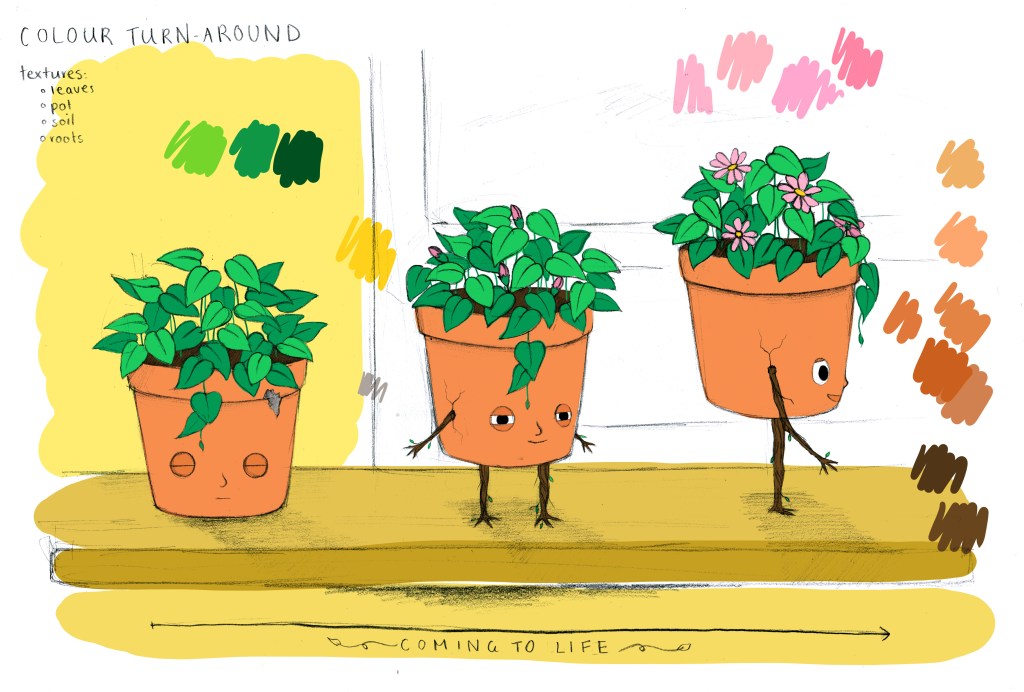
This was just a character design, textured and modelled presented in a turntable animation. I was sort of inspired by Bill and Ben the Flower Pot Men if anyone watched that. The arms and legs of my character are supposed to be roots that sprout out as it comes to life in a Toy Story sort of way.
Project 2 – Walk Cycle Animation
In my second assignment for this class we had to create a walk cycle either using our own character or a provided one. I decided to use the provided one because I was having trouble rigging my own character, and I could get this done quickly and allow more time for my final assignment. I created a confident strut kind of walk for no reason other than I wanted to.
Project 3 – Complex Animation
I am so. happy. with this animation!! It fulfils exactly the vision I had for the character and I managed to sort out every single problem I had with the rigging and animating, leaving us with a not dodgy animation!! I have nothing else to say about this other than I’m so proud of it given the troubles I’ve had with Maya in the past!
And that is everything! Another successful and productive Uni year and I am super looking forward to next year and doing some more self-directed assignments!


Your work is just amazing.
LikeLike